Statistical outliers | Statistical charts and diagrams
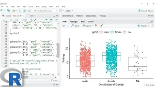
Box plot

In descriptive statistics, a box plot or boxplot is a method for graphically demonstrating the locality, spread and skewness groups of numerical data through their quartiles. In addition to the box on a box plot, there can be lines (which are called whiskers) extending from the box indicating variability outside the upper and lower quartiles, thus, the plot is also termed as the box-and-whisker plot and the box-and-whisker diagram. Outliers that differ significantly from the rest of the dataset may be plotted as individual points beyond the whiskers on the box-plot.Box plots are non-parametric: they display variation in samples of a statistical population without making any assumptions of the underlying statistical distribution (though Tukey's boxplot assumes symmetry for the whiskers and normality for their length). The spacings in each subsection of the box-plot indicate the degree of dispersion (spread) and skewness of the data, which are usually described using the five-number summary. In addition, the box-plot allows one to visually estimate various L-estimators, notably the interquartile range, midhinge, range, mid-range, and trimean. Box plots can be drawn either horizontally or vertically. (Wikipedia).

Box plot
Video thumbnail

Box and whisker plots in Plotly for Python

The box-and-whisker plot, or simply the box plot, is a very useful and commonly used plot. It displays the median, first and third quartile values and possible outliers of a continuous numerical variable. In this video I show you how to construct a box plot, how to change the colors and

From playlist Data viz using Plotly for Python

Video thumbnail

Statistics - How to make a box and whisker plot

This video covers how to make a box and whisker plot with outliers. For these types of plots often you must gather lots of information about the data. In a nutshell the box and whisker plot marks out key values about the data. For more videos visit http://www.mysecretmathtutor.com

From playlist Statistics

Video thumbnail

Boxplot - Seaborn

We go over the box plot. I show some hidden gems not in the documentation and explain what the various parts of the box plot are. Associated Github Commit: https://github.com/knathanieltucker/seaborn-weird-parts/commit/b0ffec52f518455141f8af9da326fa02bea5e418 Associated Seaborn Links: ht

From playlist Seaborn: Understanding the Weird Parts

Video thumbnail

Box and whisker plots

How to draw a box and whisker plot

From playlist Mr Arnold's Unit 1 Higher Revision

Video thumbnail

Boxplots in SPSS | An Easy Guide | Part 1

Boxplots are extremely helpful in describing data. In these two videos I demonstrate how to generate Boxplots in SPSS and interpret them. I will also show the effect of conventional and extreme outliers on the shape of Boxplots. For more information about normality, please watch this ser

From playlist Boxplots

Video thumbnail

Box and whisker plots using Plotly for R

In this tutorial I show you how to create box and whisker plots using Plotly for R. Box plots, as they are also known, are great to visualize the distribution of a continuous numerical variable. The same variable can be grouped by a categorical variable resulting in comparative box plots

From playlist Data viz using Plotly for R

Video thumbnail

Chapter 6 - Box Whisker Plot - IB Math Studies (Math SL)

Hello and welcome to What Da Math This video is an introduction to box whisker plots from Chapter 6 of Haese edition of IB Math Studies book. SUBSCRIBE for more math and math studies videos Join me on Twitter: http://twitter.com/WhatDaMath

From playlist IB Math Studies Chapter 6

Video thumbnail

Box and Whisker Plots in Tableau | Tableau Training For Beginners | Tableau Training | Simplilearn

Box Plots are used to represent the distribution of values along an axis. They are also known as box-and-whisker plots. Box plots are useful for comparing sets of data. Box-and-whisker plots are a common statistical tool that depicts the distribution of a set of data. There is a line at th

From playlist 🔥Tableau | Tableau Tutorial For Beginners | Data Analytics With Tableau | Tableau Projects | Updated Tableau Playlist 2023 | Simplilearn

Video thumbnail

Box And Whisker Plots | How To Make Box And Whisker Plot | Probability And Statistics | Simplilearn

A box and whisker plot is a graphical representation of variation in a set of data. In this probability and statistics video tutorial, you will learn all about Box and Whisker Plot. We will start with discussing the essential terms and definitions of the Box and Whisker plot and then move

From playlist 🔥Data Science | Data Science Full Course | Data Science For Beginners | Data Science Projects | Updated Data Science Playlist 2023 | Simplilearn

Video thumbnail

R - Graphs - Boxplots using Ggplot2

Recorded: Fall 2015 Lecturer: Dr. Erin M. Buchanan This video covers the basic ideas of functions using R - topics include: - ggplot2 - boxplots with one independent variable (categorical) - changing the legends, axes labels, and group labels Lecture materials and assignment available a

From playlist Learn R + Statistics

Video thumbnail

Minitab Tutorial | Minitab Training Video | What is Minitab? | Introduction to Minitab

🔥 Data Analyst Master's Program (Discount Code: YTBE15): https://www.simplilearn.com/data-analyst-masters-certification-training-course?utm_campaign=Minitab-tutorial-KJjfccxVcss&utm_medium=DescriptionFF&utm_source=youtube 🔥 Professional Certificate Program In Data Analytics: https://www.si

From playlist Minitab Tutorial For Beginners

Video thumbnail

Boxenplot - Seaborn

This video is sort of an addendum to Seaborn Understanding the Weird Parts (since this came out a little bit after I recorded the rest of the Seaborn series). Here I go over boxenplot (which is pretty similar to boxplot, but is a LOT more useful!) and show you what it can do and why it is

From playlist Seaborn: Understanding the Weird Parts

Video thumbnail

GCSE Revision Video 26 - Box Plots

Powered by https://www.numerise.com/ GCSE Revision Video 26 - Box Plots

From playlist GCSE Quick Revision List

Video thumbnail

The 5-Number Summary and Box Plots in Business Statistics (Week 6C)

The five-number summary describes a distribution using the minimum, first quartile, median, third quartile, and maximum. Its graphical equivalent is the box plot. Dr. Daniel demonstrates how to create a 5-number summary and box plot in Excel and JASP. All examples use the DogToys2.xlsx (li

From playlist Basic Business Statistics (QBA 237 - Missouri State University)

Video thumbnail

Creating Boxplots in RStudio | ggplot library

In this video, I demonstrate how to generate boxplots using RStudio / R. Getting started with RStudio: https://www.youtube.com/watch?v=aCUM4r1ONhg&list=PLTjlULGD9bNIkYLqIzneYcc9Gg2VkEzlZ Access the R Code from here: https://github.com/AriaAvi/Multivariate-Data-Analysis/blob/main/R%20code

From playlist RStudio and R

Video thumbnail

Introduction to R: Plotting in Base R

After loading data, it is important to get a sense of the distribution of the variables and how they relate to one another. This process known as exploratory data analysis or eda. Frequency tables are a tool for exploring categorical variables (variables that encode variables with a discre

From playlist Introduction to R

Video thumbnail

Box-and-Whisker Plots

This video is about Box-and-Whisker Plots

From playlist Data Displays

Video thumbnail

The 5-Number Summary and BOXPLOTS (6-10)

The Five-Number Summary gives multiple measures of variability that describe the distribution. A boxplot is the graphic equivalent to a five-number summary. Both show the center and spread of the data, and boxplots can be used to identify skewness and outliers. The five numbers are: Minim

From playlist Depicting Distributions from Boxplots to z-Scores (WK 6 QBA 237)

Related pages

Bagplot | Five-number summary | Skewness | Percentile | Statistical dispersion | Exploratory data analysis | Mid-range | Statistical population | Outlier | Midhinge | Violin plot | Seven-number summary | Interquartile range | Functional boxplot | Median | L-estimator | Quartile | Range (statistics) | Fan chart (statistics) | Trimean | Histogram | Probability distribution | Normal distribution | Standard deviation | Descriptive statistics | Kernel density estimation | Medcouple | Multimodal distribution | Candlestick chart | John Tukey