Frequency distribution | Nonparametric statistics | Statistical charts and diagrams | Estimation of densities

Histogram

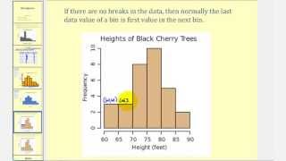
A histogram is an approximate representation of the distribution of numerical data. The term was first introduced by Karl Pearson. To construct a histogram, the first step is to "bin" (or "bucket") the range of values—that is, divide the entire range of values into a series of intervals—and then count how many values fall into each interval. The bins are usually specified as consecutive, non-overlapping intervals of a variable. The bins (intervals) must be adjacent and are often (but not required to be) of equal size. If the bins are of equal size, a bar is drawn over the bin with height proportional to the frequency—the number of cases in each bin. A histogram may also be normalized to display "relative" frequencies showing the proportion of cases that fall into each of several categories, with the sum of the heights equaling 1. However, bins need not be of equal width; in that case, the erected rectangle is defined to have its area proportional to the frequency of cases in the bin. The vertical axis is then not the frequency but frequency density—the number of cases per unit of the variable on the horizontal axis. Examples of variable bin width are displayed on Census bureau data below. As the adjacent bins leave no gaps, the rectangles of a histogram touch each other to indicate that the original variable is continuous. Histograms give a rough sense of the density of the underlying distribution of the data, and often for density estimation: estimating the probability density function of the underlying variable. The total area of a histogram used for probability density is always normalized to 1. If the length of the intervals on the x-axis are all 1, then a histogram is identical to a relative frequency plot. The histogram is one of the seven basic tools of quality control. Histograms are sometimes confused with bar charts. A histogram is used for continuous data, where the bins represent ranges of data, while a bar chart is a plot of categorical variables. Some authors recommend that bar charts have gaps between the rectangles to clarify the distinction. (Wikipedia).

Histogram
Video thumbnail

Statistics - How to make a histogram

This example shows how to make a histogram. Remember that the horizontal axis represents the values of the variables. The vertical axis gives us the frequency of those variables. For more videos visit http://www.mysecretmathtutor.com

From playlist Statistics

Video thumbnail

Histograms

More resources available at www.misterwootube.com

From playlist Data Analysis

Video thumbnail

Histogram using Plotly for Python

In this second tutorial on Plotly for Python, I show you to construct a histogram. A histogram represents a numerical variable as a bar chart, by dividing the data point values up into equally sized bins and counting how many values occur in each bin. A histogram then differs from a bar

From playlist Data viz using Plotly for Python

Video thumbnail

Histograms GCSE 1 Introduction Drawing and reading Histograms AS stats S1

www.m4ths.com GCSE and A Level Worksheets, videos and helpbooks. Full course help for Foundation and Higher GCSE 9-1 Maths All content created by Steve Blades

From playlist GCSE Histograms

Video thumbnail

Statistics: Ch 2 Graphical Representation of Data (12 of 62) Histogram (Relative Frequency)

Visit http://ilectureonline.com for more math and science lectures! We will learn what is and how data is represented in a RELATIVE frequency histogram. In this example, 25 number grades in a class. A histogram is a type of bar graph representing an entire set of data. To donate: http://

From playlist STATISTICS CH 2 GRAPHICAL REPRESENTATION OF DATA

Video thumbnail

Histograms in Statistics

Introducing the uses of histograms in statistics, how to construct them and interpret them. Check out http://www.ProfRobBob.com, there you will find my lessons organized by class/subject and then by topics within each class. Find free review test, useful notes and more at http://www.mathp

From playlist AP Statistics

Video thumbnail

Statistics: Ch 2 Graphical Representation of Data (11 of 62) Histogram (Frequency)

Visit http://ilectureonline.com for more math and science lectures! We will learn what is and how data is represented in a frequency histogram. In this example, 25 number grades in a class. A histogram is a type of bar graph representing an entire set of data. To donate: http://www.ilect

From playlist STATISTICS CH 2 GRAPHICAL REPRESENTATION OF DATA

Video thumbnail

Introduction to Histograms

This video provides an introduction to histograms and explains how to create a histogram from given data. Site: http://mathispower4u.com

From playlist Statistics: Describing Data

Video thumbnail

Introduction to Histograms | Marketing Analytics for Beginners | Part-35

It can be incredibly hard to process tons of data gathered which can result from user polls, market research, insights, pricing analytics, surveys, and ratings. Data visualizations can help explore the voluminous data, then take the decision on treating it accurately. This video talks a

From playlist Marketing Analytics for Beginners

Video thumbnail

The return of swoleios! [Research]

Broadcasted live on Twitch -- Watch live at https://www.twitch.tv/leioslabs

From playlist research

Video thumbnail

The return of swoleios! [Research]

Broadcasted live on Twitch -- Watch live at https://www.twitch.tv/leioslabs

From playlist Algorithm-archive

Video thumbnail

Becoming a fractal [Research] Day 5

Broadcasted live on Twitch -- Watch live at https://www.twitch.tv/leioslabs

From playlist research

Video thumbnail

Histograms & Frequency Polygons in SPSS (4-7)

A histogram is a type of graph – very similar to a bar chart – that easily shows us the shape of the distribution. Histograms can show us if the data are bimodal, with two major peaks. We see skewness (such as positive skew), kurtosis (how peaked or flat the distribution is), which also sh

From playlist WK4 Statistical Graphing - Online Statistics for the Flipped Classroom

Video thumbnail

This histogram fact will BLOW YOUR MIND! #Research

Broadcasted live on Twitch -- Watch live at https://www.twitch.tv/leioslabs

From playlist research

Video thumbnail

How To See In The Dark Using Image Histograms and Equalization

#SoME2 0:00 Intro 0:32 Digital Images 0:56 Color Pixels 1:30 Grayscale Images 2:17 Image Histograms 3:04 Histogram vs pmf and cdf 3:55 Histogram Equalization Demonstration 4:45 Histogram Equalization Algorithm 6:34 Outro Sources: Cat Image - https://www.pexels.com/photo/grey-fur-kitten-

From playlist Summer of Math Exposition 2 videos

Video thumbnail

M17 Histograms

Learn how to use Minitab 17 to create histograms from your quantitative data.

From playlist Minitab 17 Instructional Videos

Video thumbnail

O'Reilly Webcast: Two Big Data Analysis Tricks for Everyone

Data analysis skills are critical to staying competitive in the 21st century economy. In this webcast the author of "Head First Data Analysis," Michael Milton, provides some useful tips for common data problems that everyone faces, including: -How to enhance your career (and save the

From playlist O'Reilly Webcasts

Video thumbnail

Algorithms and GPU engineering

Broadcasted live on Twitch -- Watch live at https://www.twitch.tv/leioslabs

From playlist research

Video thumbnail

Histograms GCSE Example 5 Constucting and finding data AS Stats OCR, MEI S1

www.m4ths.com GCSE and A Level Worksheets, videos and helpbooks. Full course help for Foundation and Higher GCSE 9-1 Maths All content created by Steve Blades

From playlist GCSE Histograms

Related pages

Freedman–Diaconis rule | Normalization (statistics) | Skewness | Bar chart | Probability density function | Floor and ceiling functions | Unit interval | Interquartile range | Rounding | Pixel | V-optimal histograms | Pareto chart | Categorical variable | John Graunt | Integer | Contrast (vision) | Probability distribution | Standard deviation | Entropy estimation | Kernel (statistics) | Probit | Kernel density estimation | Binomial distribution | Interval (mathematics) | Frequency (statistics) | Density estimation