
SPSS - Scatterplots in Chart Builder Example
Recorded: Spring 2015 Lecturer: Dr. Erin M. Buchanan How to make a scatterplot, line of best fine, and scatterplot matrix in chart builder with SPSS. Used in: Basic, Intermediate, and Advanced Statistics Lecture materials and assignments available at statisticsofdoom.com. https://statis
From playlist Advanced Statistics Videos

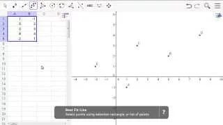
Scatter Plot and Best Fit Line
Quickstart for Desktop Version Example 4: Scatter Plot and Best Fit Line
From playlist Quickstart for Desktop
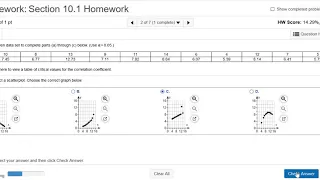
Find the Scatterplot and the Linear Correlation Coefficient using StatCrunch
Please Subscribe here, thank you!!! https://goo.gl/JQ8Nys Find the Scatterplot and the Linear Correlation Coefficient using StatCrunch
From playlist Statistics
Scatter Plot and Best Fit Line
Quickstart for Web and Tablet App Example 4: Scatter Plot and Best Fit Line
From playlist Quickstart for Web and Tablet App
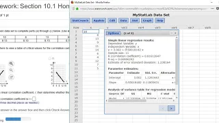
Scatterplot and Linear Correlation Coefficient with StatCrunch
Please Subscribe here, thank you!!! https://goo.gl/JQ8Nys Scatterplot and Linear Correlation Coefficient with StatCrunch
From playlist Statistics

SCATTERPLOTS: Visualize Relationships Between Two Scale Variables (4-4)
Scatter Diagram (a.k.a. Scatterplot) is a graph used with correlation and regression. It summarizes the relationship between two quantitative variables. Trendline (a.k.a. Regression line) approximates the relationship between the two variables. A pair of scale variables, X and Y, are plott
From playlist Data Visualization for Variables in Statistics (WK 4 - QBA 237)
Linear Regression on the Graphing Calculator
http://mathispower4u.wordpress.com/
From playlist Linear Equations and Lines

R - Graphs - Scatter Plots in Ggplot2
Recorded: Fall 2015 Lecturer: Dr. Erin M. Buchanan This video covers the basic ideas of functions using R - topics include: - ggplot2 - scatterplots - scatterplots with lines of best fit - grouped scatterplots with lines of best fit - changing the legends, axes labels, and group labels
From playlist Learn R + Statistics

ggplot2 Tutorial | ggplot2 In R Tutorial | Data Visualization In R | R Training | Edureka
( R Training : https://www.edureka.co/data-analytics-with-r-certification-training ) This "ggplot2 Tutorial" by Edureka is a comprehensive session on the ggplot2 in R. This tutorial will not only get you started with the ggplot2 package, but also make you an expert in visualizing data wit
From playlist Data Science Tutorial Videos
Scatterplots, Part 1: Form & Direction of Relationship
This video shows how to interpret scatterplots for describing the relationship between two quantitative variables. It demonstrates the Scatterplots & Correlation app from ArtofStat.com, using examples to explain the form of the relationship (approximately linear, non-linear, or no relation
From playlist Chapter 3: Relationships between two variables
7.2.9 An Introduction to Visualization - Video 5: Advanced Scatterplots Using ggplot
MIT 15.071 The Analytics Edge, Spring 2017 View the complete course: https://ocw.mit.edu/15-071S17 Instructor: Allison O'Hair How to create more advanced scatterplots in R using ggplot that include color and linear regression. License: Creative Commons BY-NC-SA More information at https:
From playlist MIT 15.071 The Analytics Edge, Spring 2017
R - Graphs - Ggplot2 Overview Lecture and Examples
Lecturer: Dr. Erin M. Buchanan Missouri State University Fall 2016 Notes from Field's Discovering Statistics Using R - please note that this lecture was recorded live in class, complete with internet hiccups, Hmisc troubles, and student questions. Please let me know if I need to clarify
From playlist Advanced Statistics Videos

How do I... USE & CREATE SCATTERPLOTS in Jamovi? (2022)
Can I use scatterplots in Jamovi? Where do scatterplots appear in Jamovi analyses? The default ones are a little — are there other options? I have these answers and more in this next episode of learning stats with Jamovi! Jamovi stats: https://www.jamovi.org/ NOTE: My tutorials always us
From playlist Jamovi 2022 Tutorials


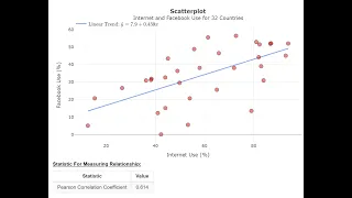
Correlation Scatterplots – Graphing Correlation Data (13-4)
Before we calculate a correlation to see if two variables are linearly related, it is a good idea to look at a picture of our data. We do this using a scatterplot. A scatterplot is used to graphically display correlational data. The relationship between the variables is depicted with dots
From playlist WK13 Correlation - Online Statistics for the Flipped Classroom
How to Create a Scatter Plot in Statcrunch
Please Subscribe here, thank you!!! https://goo.gl/JQ8Nys How to Create a Scatter Plot in Statcrunch
From playlist StatCrunch
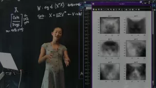
Dimensionality Reduction: Eigenpets, Part 2
Data Science for Biologists Dimensionality Reduction: Eigenpets Part 2 Course Website: data4bio.com Instructors: Nathan Kutz: faculty.washington.edu/kutz Bing Brunton: faculty.washington.edu/bbrunton Steve Brunton: faculty.washington.edu/sbrunton
From playlist Data Science for Biologists
From playlist Exploratory Data Analysis

Tableau Charts & Graphs | Tableau Charts Examples and when to use them | Edureka Tableau Live-2
Tableau Certification Training : https://www.edureka.co/tableau-certification-training In this Edureka Live, you will learn to work on Tableau Charts & Graphs. Charts such as Line, Bar, Pareto are among the various popular charts explained in this video with a working DEMO. Check our Ta
From playlist Edureka Live Classes 2020