Statistical charts and diagrams
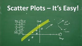
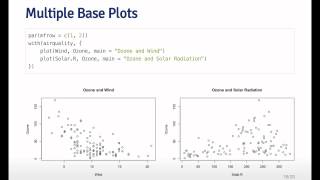
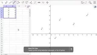
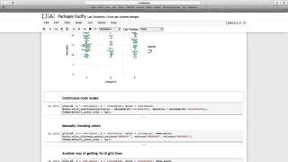
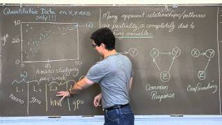
A scatter plot (also called a scatterplot, scatter graph, scatter chart, scattergram, or scatter diagram) is a type of plot or mathematical diagram using Cartesian coordinates to display values for typically two variables for a set of data. If the points are coded (color/shape/size), one additional variable can be displayed.The data are displayed as a collection of points, each having the value of one variable determining the position on the horizontal axis and the value of the other variable determining the position on the vertical axis. (Wikipedia).
Statistics - Making a scatter plot
This video will show you how to make a simple scatter plot. Remember to put your independent variable along the x-axis, and you dependent variable along the y-axis. For more videos please visit http://www.mysecretmathtutor.com
From playlist Statistics
Scatter plots using Plotly for R
This videos show the creation of scatter plots using Plotly for the R programming language. The files are available online. R-markdown: https://github.com/juanklopper/Plotly-for-R RPubs: http://rpubs.com/juanhklopper/scatter_plots_using_plotly
From playlist Statistics
Learn Scatter Plot’s – It’s Easy!
TabletClass Math: https://tcmathacademy.com/ This video explains scatter plots in algebra – main concepts in the video are correlation and how to find the linear equation of a best fitting line.
From playlist Algebra
Scatter Plot and Best Fit Line
Quickstart for Desktop Version Example 4: Scatter Plot and Best Fit Line
From playlist Quickstart for Desktop
How to Make a Scatter Plot Matrix in R
Scatter plot matrix is a plot that generates a grid of pairwise scatter plots for multiple numeric variables. Creating a scatter plot matrix can be a useful way to visually explore relationships between several numeric variables quickly. Code used in this code clip: library(tidyverse) li
From playlist Code Clips: R Plots
Scatter plots using Plotly for Python
In this tutorial on Plotly for Python I take a look at scatter plots. They are very useful charts and plot pairs of values for two variables. Plotly actually makes is quite easy to introduce a third and even a fourth variable onto the 2D plane of a figure. Jupyter notebook files are ava
From playlist Data viz using Plotly for Python
From playlist Exploratory Data Analysis
Scatter Plot and Best Fit Line
Quickstart for Web and Tablet App Example 4: Scatter Plot and Best Fit Line
From playlist Quickstart for Web and Tablet App
Package Gadfly 06 Scatter plots Lines More examples
In this section I revisit scatter plots, add some vertical and horizontal lines and show a variety of other Gadfly goodies.
From playlist The Julia Computer Language
R - Graphs - Scatter Plots in Ggplot2
Recorded: Fall 2015 Lecturer: Dr. Erin M. Buchanan This video covers the basic ideas of functions using R - topics include: - ggplot2 - scatterplots - scatterplots with lines of best fit - grouped scatterplots with lines of best fit - changing the legends, axes labels, and group labels
From playlist Learn R + Statistics
Matplotlib Tutorial (Part 7): Scatter Plots
In this video, we will be learning how to create scatter plots in Matplotlib. This video is sponsored by Brilliant. Go to https://brilliant.org/cms to sign up for free. Be one of the first 200 people to sign up with this link and get 20% off your premium subscription. In this Python Prog
From playlist Matplotlib Tutorials
Ex: Matching Correlation Coefficients to Scatter Plots
This video provides several examples of how to match the value of a correlation coefficient to a scatter plot. Site: http://mathispower4u.com
From playlist TI-84: Regression on the Graphing Calculator
How do I... USE & CREATE SCATTERPLOTS in Jamovi? (2022)
Can I use scatterplots in Jamovi? Where do scatterplots appear in Jamovi analyses? The default ones are a little — are there other options? I have these answers and more in this next episode of learning stats with Jamovi! Jamovi stats: https://www.jamovi.org/ NOTE: My tutorials always us
From playlist Jamovi 2022 Tutorials
Scatter Plot Intro and Lurking Variables defined
I introduce the structure of scatterplots and explain what characteristics you will need to use to intrepret them. I discuss how lurking variables can help to form the patterns that we see. I also go over the two type of outliers we may see in scatterplots. Check out http://www.ProfRobB
From playlist AP Statistics
Transformation and Weighting to correct model inadequacies (Part A)
Regression Analysis by Dr. Soumen Maity,Department of Mathematics,IIT Kharagpur.For more details on NPTEL visit http://nptel.ac.in
From playlist IIT Kharagpur: Regression Analysis | CosmoLearning.org Mathematics
Excel Statistical Analysis 08: X-Y Scatter Charts for Linear Data: Excel Chart? Analyze Data Button?
Download Excel File: https://excelisfun.net/files/Ch02-ESA.xlsm Learn about how to create X-Y Linear Data Scatter Charts from X-Y data in Excel using Excel Charts and the Microsoft Artificial Intelligence Data Analyze Button. Topics: 1. (00:00) Introduction 2. (00:34) First X-Y Scatter Dat
From playlist Excel Statistical Analysis for Business Class Playlist of Videos from excelisfun
SCATTERPLOTS: Visualize Relationships Between Two Scale Variables (4-4)
Scatter Diagram (a.k.a. Scatterplot) is a graph used with correlation and regression. It summarizes the relationship between two quantitative variables. Trendline (a.k.a. Regression line) approximates the relationship between the two variables. A pair of scale variables, X and Y, are plott
From playlist Data Visualization for Variables in Statistics (WK 4 - QBA 237)