Meta-analysis | Statistical charts and diagrams

Funnel plot

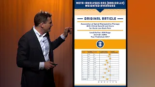
A funnel plot is a graph designed to check for the existence of publication bias; funnel plots are commonly used in systematic reviews and meta-analyses. In the absence of publication bias, it assumes that studies with high precision will be plotted near the average, and studies with low precision will be spread evenly on both sides of the average, creating a roughly funnel-shaped distribution. Deviation from this shape can indicate publication bias. (Wikipedia).

Funnel plot
Video thumbnail

Box and whisker plots in Plotly for Python

The box-and-whisker plot, or simply the box plot, is a very useful and commonly used plot. It displays the median, first and third quartile values and possible outliers of a continuous numerical variable. In this video I show you how to construct a box plot, how to change the colors and

From playlist Data viz using Plotly for Python

Video thumbnail

Scatter plots using Plotly for R

This videos show the creation of scatter plots using Plotly for the R programming language. The files are available online. R-markdown: https://github.com/juanklopper/Plotly-for-R RPubs: http://rpubs.com/juanhklopper/scatter_plots_using_plotly

From playlist Statistics

Video thumbnail

Scatter plots using Plotly for Python

In this tutorial on Plotly for Python I take a look at scatter plots. They are very useful charts and plot pairs of values for two variables. Plotly actually makes is quite easy to introduce a third and even a fourth variable onto the 2D plane of a figure. Jupyter notebook files are ava

From playlist Data viz using Plotly for Python

Video thumbnail

Subplots using Plotly for Python

In this tutorial I describe the all important process of creating more than one plot in a single figure. Plots can be placed on a grid specified by row and column size. Even these, though, can be scaled. I also show you how to scare axes and how to create odd pairings. Jupyter notebook

From playlist Data viz using Plotly for Python

Video thumbnail

SCATTERPLOTS: Visualize Relationships Between Two Scale Variables (4-4)

Scatter Diagram (a.k.a. Scatterplot) is a graph used with correlation and regression. It summarizes the relationship between two quantitative variables. Trendline (a.k.a. Regression line) approximates the relationship between the two variables. A pair of scale variables, X and Y, are plott

From playlist Data Visualization for Variables in Statistics (WK 4 - QBA 237)

Video thumbnail

Using a set of points determine if the figure is a parallelogram using the midpoint formula

๐Ÿ‘‰ Learn how to determine the figure given four points. A quadrilateral is a polygon with four sides. Some of the types of quadrilaterals are: parallelogram, square, rectangle, rhombus, kite, trapezoid, etc. Each of the types of quadrilateral has its properties. Given four points that repr

From playlist Quadrilaterals on a Coordinate Plane

Video thumbnail

Graphing Equations By Plotting Points - Part 1

This video shows how to graph equations by plotting points. Part 1 of 2 http://www.mathispower4u.yolasite.com

From playlist Graphing Various Functions

Video thumbnail

Determine if a set of points is a parallelogram using the distance formula

๐Ÿ‘‰ Learn how to determine the figure given four points. A quadrilateral is a polygon with four sides. Some of the types of quadrilaterals are: parallelogram, square, rectangle, rhombus, kite, trapezoid, etc. Each of the types of quadrilateral has its properties. Given four points that repr

From playlist Quadrilaterals on a Coordinate Plane

Video thumbnail

Statistical Rethinking 2023 - 14 - Correlated Features

Course: https://github.com/rmcelreath/stat_rethinking_2023 Music: https://www.youtube.com/watch?v=uf-kTuIfbvM Owl: https://www.youtube.com/watch?v=VNcLbMYwhXQ Pause: https://www.youtube.com/watch?v=pxPdsqrQByM Outline 00:00 Introduction 02:04 Correlated varying effects 12:13 Building the

From playlist Statistical Rethinking 2023

Video thumbnail

Plotly for python

In this new series I take a look at my favorite plotting library of all time. Plotly. Plotly is a cloud service for plotting. It can also be used in many programming languages, though. In this playlist I will be showing you how to use it with Python in a Jupyter notebook. The files ar

From playlist Data viz using Plotly for Python

Video thumbnail

Model Adequacy Checking (Part B)

Regression Analysis by Dr. Soumen Maity,Department of Mathematics,IIT Kharagpur.For more details on NPTEL visit http://nptel.ac.in

From playlist IIT Kharagpur: Regression Analysis | CosmoLearning.org Mathematics

Video thumbnail

Statistical Rethinking 2022 Lecture 13 - Multi-Multilevel Models

Slides and other course materials: https://github.com/rmcelreath/stat_rethinking_2022 Music: https://www.youtube.com/watch?v=R2d2spnXyLA Glass blowing: https://www.youtube.com/watch?v=apDH4YEv3_c Chapters: 00:00 Introduction 08:25 Multiple cluster types 29:00 Multilevel predictions 38:39

From playlist Statistical Rethinking 2022

Video thumbnail

Transformation and Weighting to correct model inadequacies (Part A)

Regression Analysis by Dr. Soumen Maity,Department of Mathematics,IIT Kharagpur.For more details on NPTEL visit http://nptel.ac.in

From playlist IIT Kharagpur: Regression Analysis | CosmoLearning.org Mathematics

Video thumbnail

Power BI Charts Tutorial | Data Visualization using Power BI Charts | Edureka | Power BI Live - 2

๐Ÿ”ฅEdureka Power BI Training - https://www.edureka.co/power-bi-certification-training This Edureka Tutorial on "Power BI Charts" deals with the importance of all the basic visualizations available on Power BI Desktop. It will help you create Impactful and Comprehensive Reports on the Power

From playlist Edureka Live Classes 2020

Video thumbnail

Tobias Weich: Resonance chains on Schottky surfaces

Find this video and other talks given by worldwide mathematicians on CIRM's Audiovisual Mathematics Library: http://library.cirm-math.fr. And discover all its functionalities: - Chapter markers and keywords to watch the parts of your choice in the video - Videos enriched with abstracts, b

From playlist SPECIAL 7th European congress of Mathematics Berlin 2016.

Video thumbnail

David Borthwick: Asymptotics of resonances for hyperbolic surfaces

Abstract: After a brief introduction to the spectral theory of hyperbolic surfaces, we will focus on the problem of understanding the asymptotic distribution of resonances for hyperbolic surfaces. The theory of open quantum chaotic systems has inspired several interesting conjectures about

From playlist Mathematical Physics

Video thumbnail

[Phoenics] A Bayesian Optimizer for Chemistry | AISC Author Speaking

For more details including paper and slides, visit https://aisc.a-i.science/events/2019-04-18/

From playlist Machine Learning for Scientific Discovery

Video thumbnail

Determining if a set of points is a rhombus, square or rectangle

๐Ÿ‘‰ Learn how to determine the figure given four points. A quadrilateral is a polygon with four sides. Some of the types of quadrilaterals are: parallelogram, square, rectangle, rhombus, kite, trapezoid, etc. Each of the types of quadrilateral has its properties. Given four points that repr

From playlist Quadrilaterals on a Coordinate Plane

Video thumbnail

Student Video: Potential Energy Surfaces

MIT RES.3-004 Visualizing Materials Science, Fall 2017 Speaker: Anna Morales Melgares View the complete course: https://ocw.mit.edu/RES-3-004F17 YouTube Playlist: https://www.youtube.com/playlist?list=PLUl4u3cNGP62EJXwSgoVRfh1tEiSc01bh A simple Monte Carlo Method to simulate Potential Ene

From playlist MIT RES.3-004 Visualizing Materials Science, Fall 2017

Related pages

Forest plot | Variance | Galbraith plot | Weight function | Systematic review | Confidence interval | Meta-analysis | Publication bias | Cartesian coordinate system | Study heterogeneity | Symmetry | Effect size